Beauty Website Template
Verra is a website template designed and developed as part of a university project focused on branding, layout systems, and front-end implementation. Created for a fictional skincare clinic, Verra showcases how strong design principles, user research, and technical structure come together to support user engagement in the beauty and wellness space.
The goal was to create a professional-grade responsive website that would serve the needs of a hypothetical skincare brand. While the clinic was fictional, our process was grounded in real-world UX methodology, which included persona creation, user journey mapping, content planning, and SEO strategy. The full site was developed using HTML, CSS, and JavaScript, and deployed on GitHub Pages.
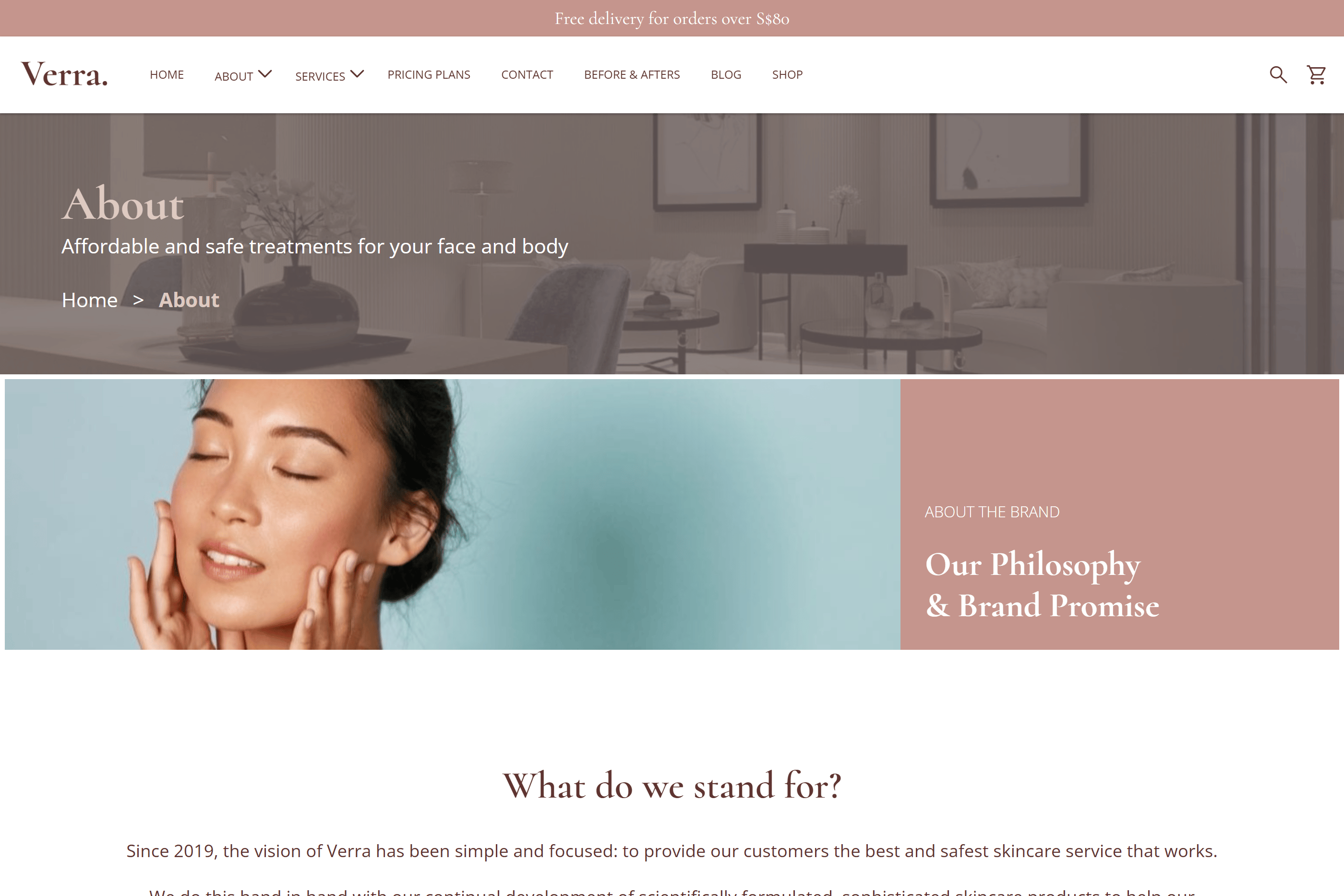
We began by establishing a visual identity aligned with the values of trust, professionalism, and calm. Our chosen color palette featured muted reds, pinks, and greens — colors associated with health, femininity, and nature. For typography, we used: Cormorant for headers, giving the site a timeless, editorial feel, and Open Sans for body text, ensuring high readability on all screen sizes Whitespace was intentionally used to create a sense of luxury and clarity. Call-to-action buttons were styled to blend elegance with visibility, supporting conversion goals while preserving the soft visual tone.
Next, the process began in earnest with wireframing and site mapping, followed by moodboarding and design system setup. We created three key personas: Thrifty Thalia, Efficient Elaine, and Classy Cleona, to guide our layout and content decisions. Each persona represented a different type of skincare customer, which helped us simulate real-world use cases in our interface structure.
The site was then broken down into modular HTML pages, and styled with consistent CSS classes. Pages were linked through a structured navbar and footer system, with internal navigation kept shallow for faster access to essential content. ’Contact Us’ Call-to-action sections were placed across multiple pages to reinforce actionability.