USS App Redesign
A redesign of the Universal Studios Singapore (USS) app for parkgoers
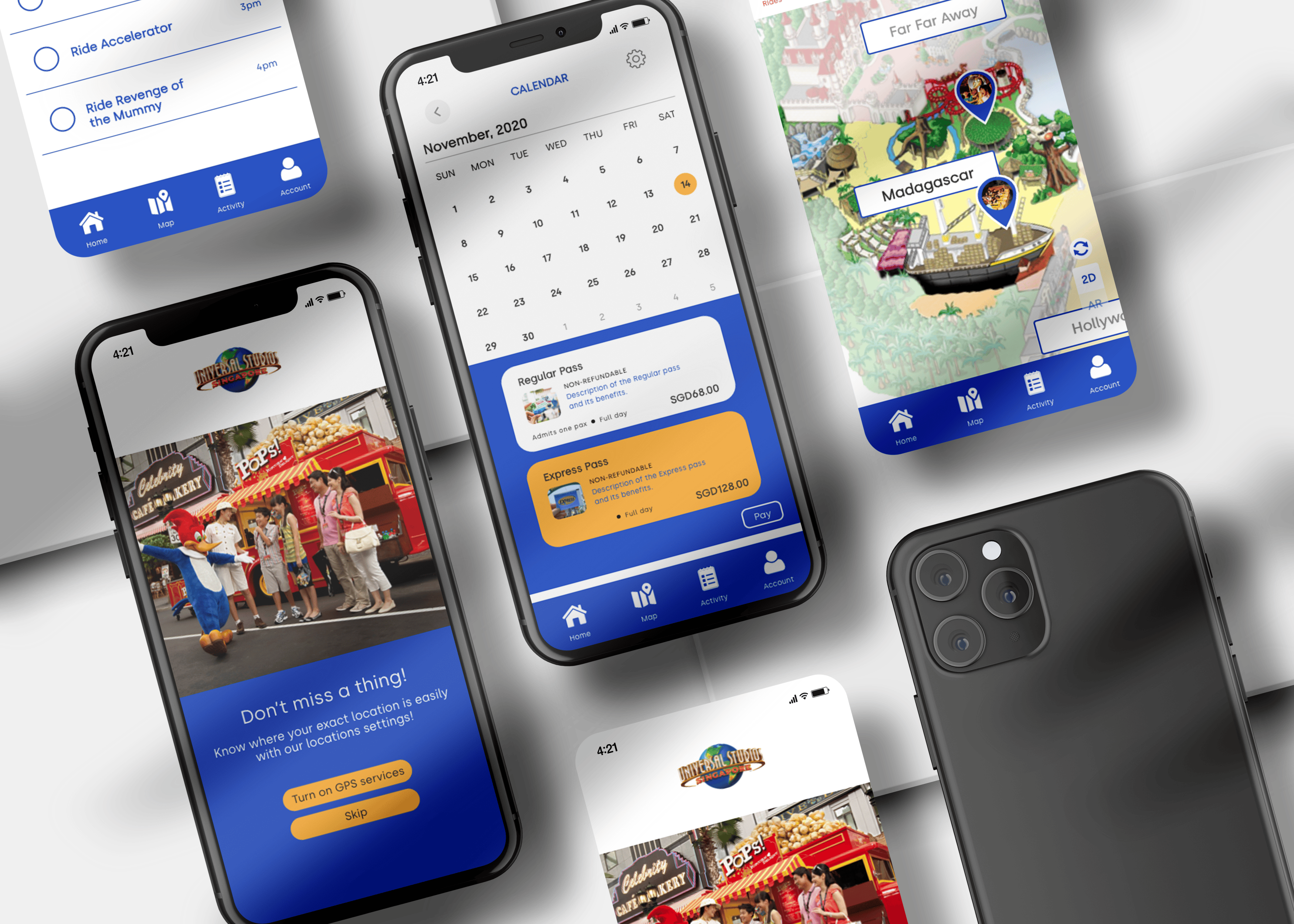
We redesigned the Universal Studios Singapore (USS) mobile application with the goal of improving the park experience for both new and returning visitors. The app includes features like ticket purchasing, virtual queues, interactive maps, and AR navigation.
We conducted three rounds of user testing across the project, with each session informing the next phase of design. Our methodology involved task-based usability testing, think-aloud protocols, and structured feedback collection. Participants were asked to complete realistic tasks while navigating the prototype on mobile, including buying tickets, joining queues, and using the map or AR features. Voice recordings and observational notes helped us capture both explicit and unspoken moments of confusion, delight, or hesitation, which allowed us to surface deeper usability issues and inform meaningful design decisions.
The project began with three separate prototype concepts, created in Figma, each exploring different layouts and features. After preliminary feedback, we merged the best ideas into a single combined prototype. This version incorporated clearer navigation, streamlined ticketing, and a revamped virtual queue system.
Round 1: Early Prototypes
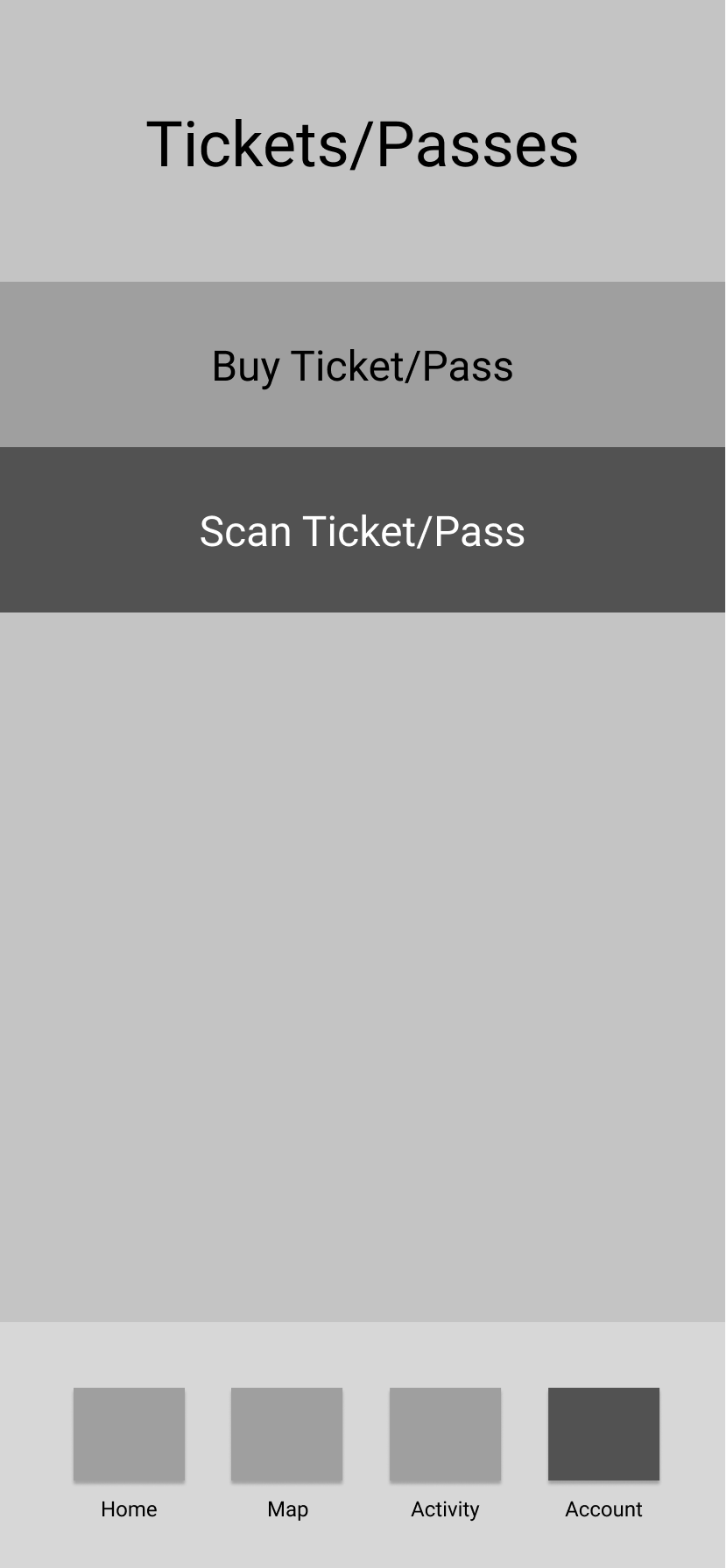
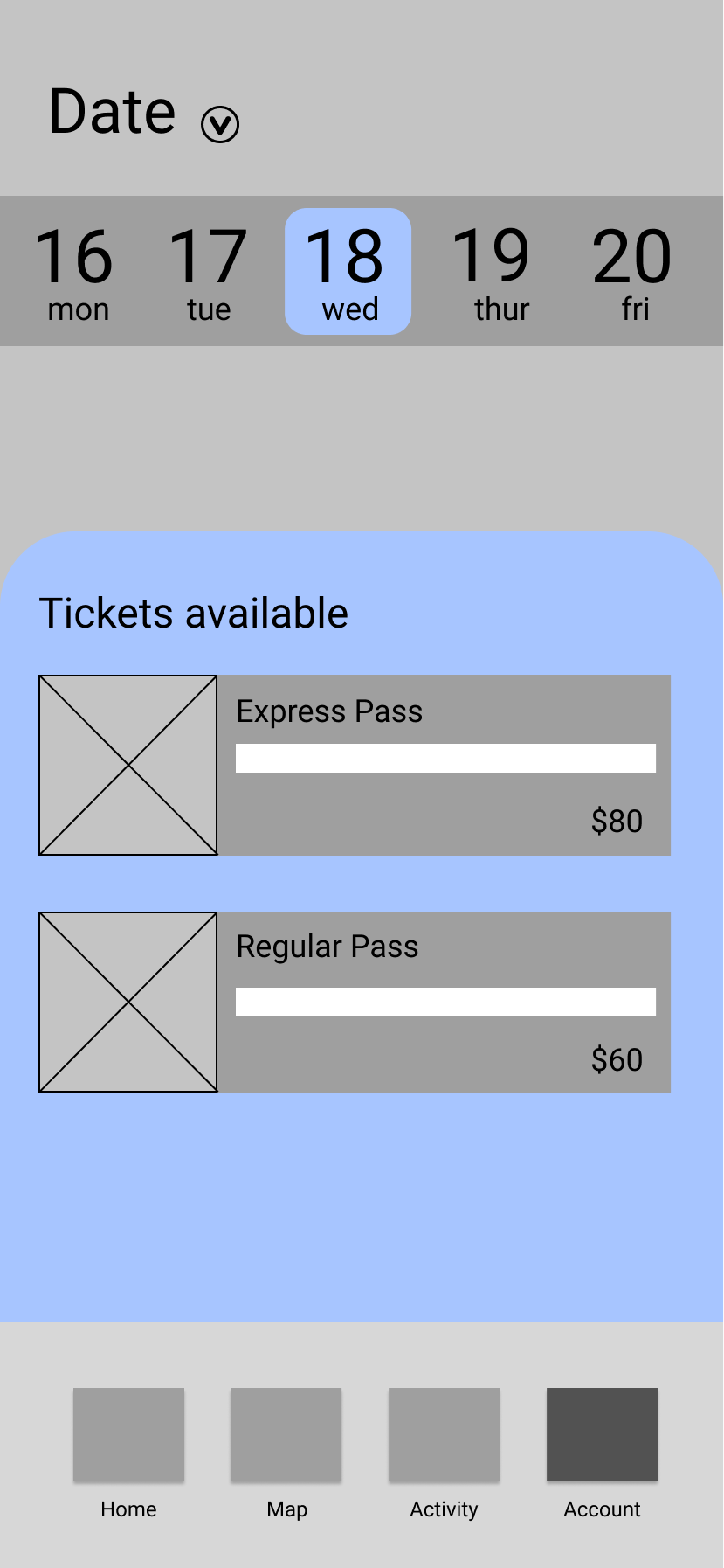
In the first round, five participants tested our initial wireframes. While the limited interactivity made it harder to assess user flow, we received valuable first impressions and feature preferences. Users found the ticketing process confusing — especially the distinction between ‘Buy Ticket’ and ‘Scan Ticket’ — and felt it should be condensed into fewer screens. They also expressed interest in a full monthly calendar for date selection.
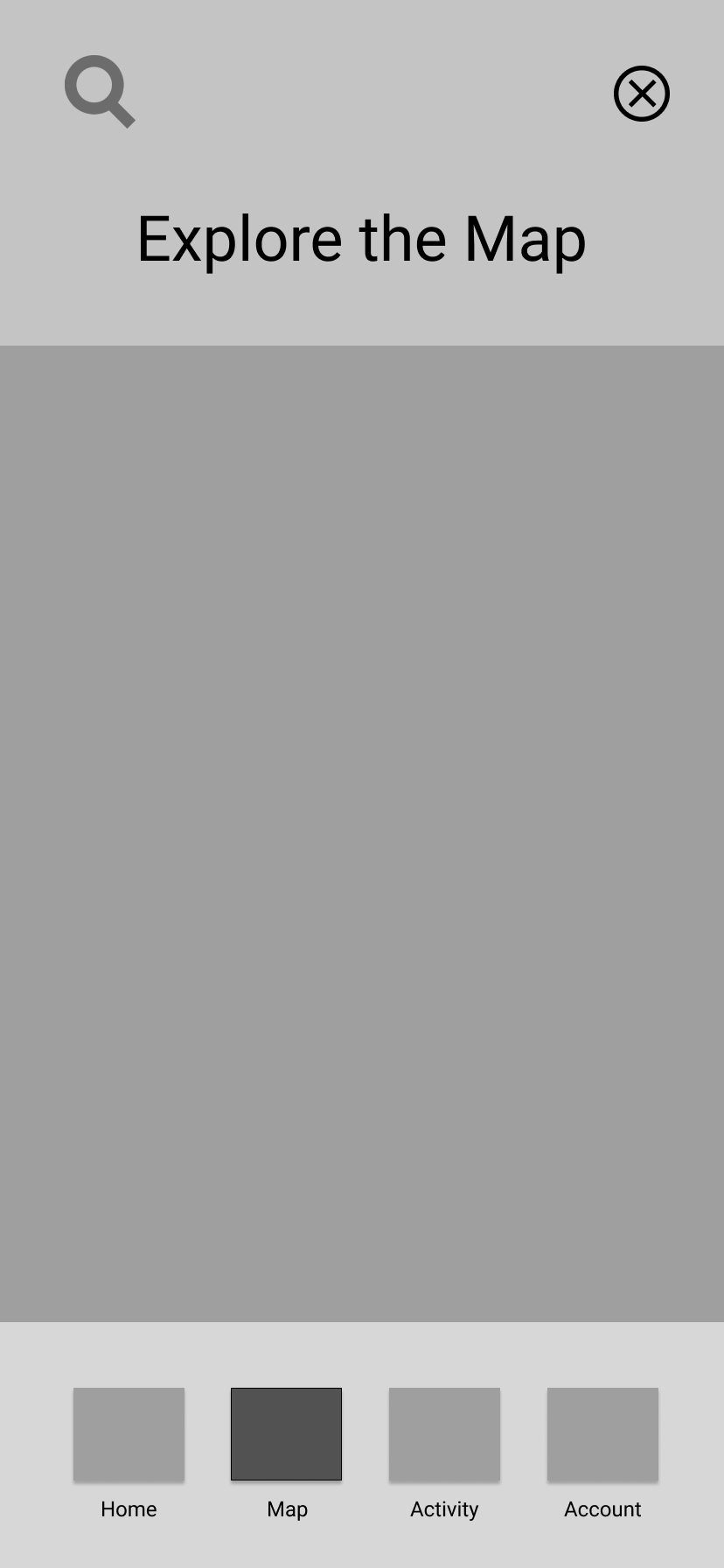
Navigation feedback varied, with some users preferring a sidebar and others a bottom nav bar. Ultimately, we implemented both to maximize accessibility. A card sorting exercise also helped us understand how users categorize park features, influencing the navigation structure moving forward.
Round 2: Combined Prototype
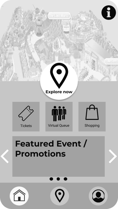
With a more complete prototype, we focused on testing user flow. All three participants completed tasks successfully, including signing up, purchasing tickets, and using the virtual queue and AR features. One usability concern was that the ‘Explore Now’ button was positioned too high on the screen, making it harder to tap comfortably. There were also requests for clearer instructions on how to use digital tickets.
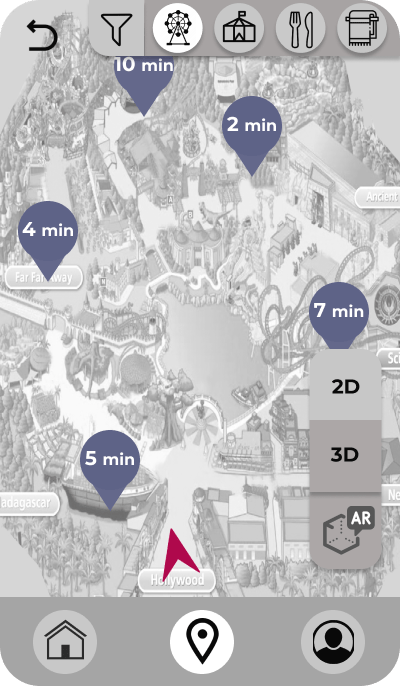
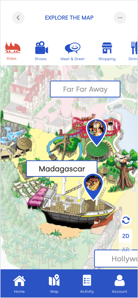
In response to the above issues, we refined the onboarding process and added contextual guidance within the ticketing screens. Participants also suggested enhancing map usability by allowing users to save favorite locations for faster access. To support this, we introduced a favorites feature and improved the visual clarity of the map through added tooltips and icon labels.
Round 3: High-Fidelity Testing
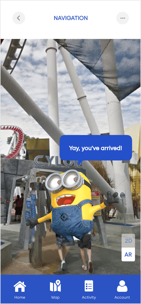
Our final round of testing involved four participants and used the high-fidelity prototype deployed on actual mobile devices. This round aimed to validate not only functionality and flow but also aesthetics, polish, and responsiveness. Feedback here was largely positive. Users praised the visual design, color scheme, and clean layout. The USS character guides, which were introduced as a playful way to personalize navigation, were a hit, especially among younger users.
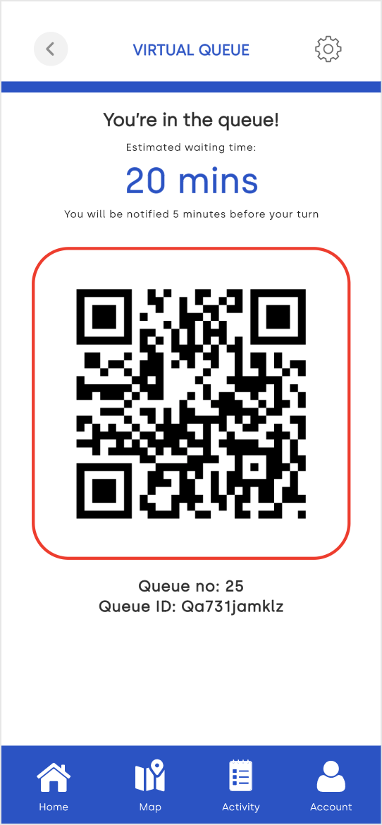
However, some areas still needed refinement. Users pointed out that certain interactive elements, like the queue management screen, could benefit from added flexibility such as allowing users to queue for multiple rides at once or browse the app while waiting. Others felt that essential features like the virtual queue or activity tab were buried too deep and should be more accessible from the home screen or navigation bar. Minor usability issues were also noted, including buttons that were too small for touch interaction and inconsistencies in screen layouts. While the overall reception was positive, these insights helped us identify priorities for future iterations.